1. what size?
From a technical point of view, it is increasingly difficult to make generally valid specifications for the minimum or maximum sizes of images on the web. The further development of display technology with ever better display quality on the one hand and ever higher data transmission speeds on the other make both the ever smaller and ever larger display of images possible in a meaningful way, from thumbnails with a tiny 80 pixel edge length to screen-filling photos. However, there are of course technical issues to consider when choosing the right image size.
When considering the image size, a distinction must first be made between the file size and the display size of the image file. Both sizes are related: The bitmap file consists of a certain number of pixels, each of which can have a certain colour value. Once integrated into the website, the image therefore takes up the space of the corresponding number of screen pixels - this is the display size. Each of the pixels is stored in an image file with a suitable numerical value for its colour. Various methods of compression are used to reduce the amount of data - this results in the file size.
Large images look great, preferably with lots of colours and little compression. However, the resulting data volumes are at the expense of the transfer time of the image file. Since the loading time is also an important quality criterion of a website, the experienced web gardener always seeks the optimal compromise of the highest possible display quality with the smallest possible file size.
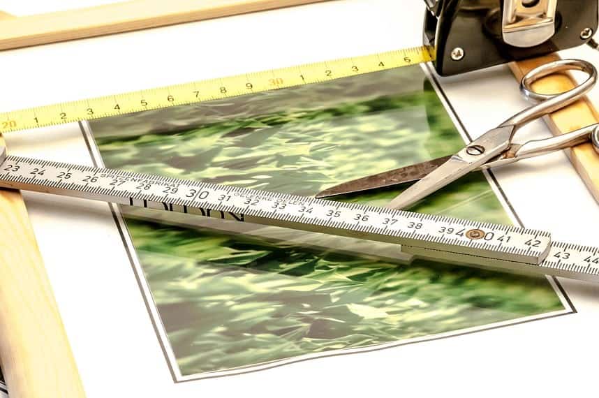
When preparing image files for publication on the web, it is first important to determine the pixel size in which the image is to be displayed on the screen after publication. If, for example, an existing image is to be replaced, it is advisable to determine the pixel size of the graphic to be replaced and use this as the target size for the new image. (A practical solution, for example, in the Firefox browser: right-click on the image -> "Show graphic info". The "Inspector", which is now on board in many browser programmes as part of the developer functions, also helps with information. A screen ruler, such as the "Measure-it" plug-in available for various browsers, is also very useful).
If you know the final output size of your web graphics and provide the images in this pixel size, you are generally not doing anything wrong. For a long time, you could always see it directly when images were displayed in the browser at a scale other than 1:1, whether enlarged or reduced: it always looked unfavourable, blurred, noisy and pixelated. The golden rule of bringing the graphics to the output size from the outset and not letting the display programme - i.e. the browser - do the scaling is still justified.
However, the picture has changed a little in the recent past. The capabilities of the various browser programmes for scaling image files have clearly increased. The enlarged display of images should still be avoided, as the display programme must in principle add pixels that are not included in the image file - which naturally has a negative impact on quality. However, the display of images in a size smaller than the original pixel size is respectable for the most common modern browsers.
But why should images be made available in a larger than intended pixel size if, on the other hand, this unnecessarily increases the file size? This is simply because in times of more flexible, possibly responsive, designs including lightboxes and thumbnail previews, it is no longer easy to determine a clear display size for each image.
It may therefore be necessary and possibly even beneficial for access times to display larger image files in a smaller size (and thus save time-consuming additional HTTP accesses for reloading larger image versions, for example). The target value for calculating the pixel sizes of web graphics should therefore be the largest required display size for most common applications.
2. which file format?
Once the desired graphic is available in the correct pixel size, the next question arises: In which file format should the graphic now best be saved for display on the web? As you know, the most common formats to choose from are JPEG, GIF and PNG.
GIF displays bitmaps with up to 256 different colours. One of these 256 colours can be defined as transparent. The GIF provides for the possibility of storing automatically running image sequences within an image file, which makes animated graphics possible. The data is compressed without loss, the compression is most effective for motifs with large areas of the same colour and little optical noise.
The PNGThe format knows different colour depths (from 8-bit = 256 colours up to 24-bit true colour), also offers 8-bit = 256 gradations extra for the storage of graduated transparencies and also compresses loss-free.
JPG The 24-bit true colour version widely used on the web can handle over 16.7 million different colour values and the image content is compressed using a number of different lossy processes, which means that the display quality increasingly suffers visibly with strong compression. Transparencies are not supported by this format.
In order to choose the right one from these possibilities, the web gardener first takes a look at the content of the image file. If it is a rather simple graphic motif or even a text element with large monochrome areas and straight, high-contrast edges, as is typically the case with logo graphics, PNG or GIF is the format of choice. The monochrome areas can be compressed well with these formats, while the edges remain sharp and high-contrast. Very small file sizes can be achieved by deliberately reducing the related colour palette.
The JPEG format would produce visible blurring and unsharpness especially at the edges of such motifs within the scope of compression without achieving advantages in file size.
The situation is different when it comes to more complex, smaller and more colourful motifs such as photos. This is where the JPEG format comes into its own and produces attractive image files with a significant reduction in file size. How far you can go with the degree of compression before the quality visibly decreases depends on the subject in question and, if in doubt, can be determined by experimentation - or you can simply stick to "safe" moderate compression settings.
PNG is capable of qualitatively equivalent representation of photos, but cannot keep up with the file sizes achieved for such motifs. In GIF, the forced reduction of the colour depth to 256 colours would often lead to visible quality losses.
Example 1: Logo


left PNG-8: 3kb, right JPEG: 8 kb. Even with fairly strong compression, the JPEG format cannot keep up in terms of file size. Despite the larger file size, however, it looks better than the PNG
blurred and out of focus. 

The 5-fold enlargement of the two graphics makes it particularly clear: clear edges and colour areas in the PNG versus compression mud in the JPEG
Example 2: Photo


left PNG: 33kb, right JPEG: 18 kb. The PNG format gets the short end of the stick when it comes to compression. 

Too much colour - clearly visible in the enlargement on the left: There was not enough space in the 256-colour palette of the PNG for the blue tones in the blurred background. The result is areas of colour where there shouldn't be any and tone breaks instead of flowing colour gradations (in both examples, GIF produces similar results to PNG at slightly larger file sizes).
3. what resolution?
When scaling or recalculating an image file to the desired output size, a DPI value can typically be specified for the resolution. Which value is the right one for the correct output on the screen? The answer is amazingly simple: it doesn't matter.
The term DPI (= dots per inch) refers to the density of the pixels of the graphic per inch of the output medium during output. As the pixels of a bitmap graphic are represented by pixels, the term PPI = pixel per inch is more appropriate. The specification is particularly important for printing. A graphic with a pixel size of 300×300 pixels would have an output size of exactly 1×1 inch when printed at 300 dpi/ppi; at 150 dpi/ppi, only 150 pixels would be placed on each output inch, resulting in an output size of 2×2 inches. As the amount of data would be the same in both cases and only the print density would differ, the printed image would be larger in the second case, but the sharpness of the image would be reduced accordingly.
The output size on the screen, however, has always been decoupled from units of length such as centimetres or inches; what counts here is the absolute pixel size, or a relative value such as the percentage of the available window width. How many centimetres the display ultimately takes up on the screen varies depending on the output device as significantly as, for example, the screen area of a compact mobile phone differs from the 28-inch display.
It is ultimately irrelevant for the screen output whether the DPI field contains the common 72 DPI, or 96, or 100, or 300. Use your lucky number. Or maybe 42.
In summary:
If you want to embellish your web garden with new images, first check the maximum planned display size of the graphics and scale the image files to this pixel size. The appropriate file format for the output depends on the content: GIF or PNG with the sparsest possible colour palette are often the right choice for logos, lettering elements and similar simple graphic motifs. The JPEG format is usually used for photos. The DPI value can be safely disregarded.
